Black Horse – Rebrand
Black Horse is a business division of Lloyds TSB that deals with loans and personal finance both directly to consumers and via retailers and dealers.
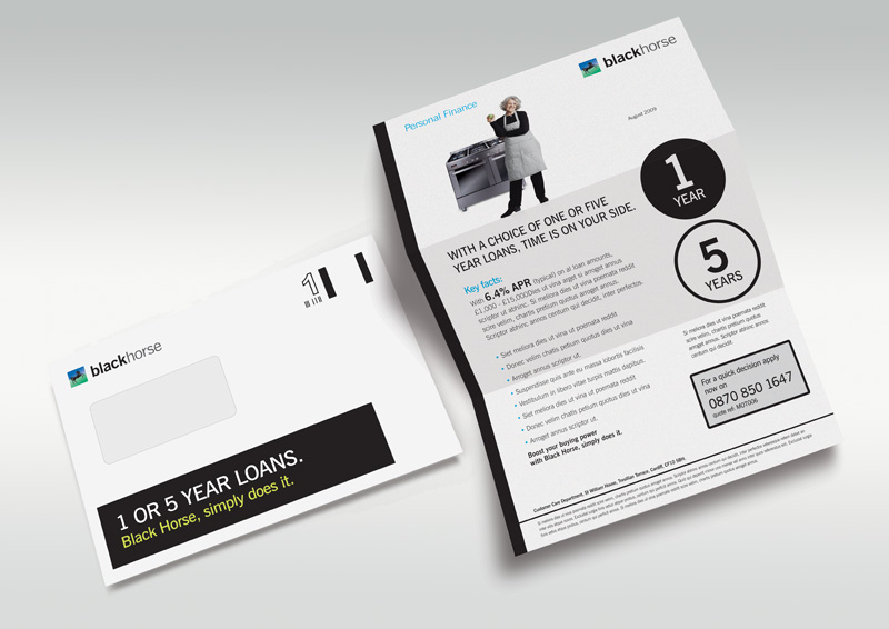
The previous brand identity had around 50 colours in the palette and used a mixture of photography and illustration with no cohesion between the communications. I wanted to strip away the varied colour palette, make the branding more visible, and give Black Horse an ownable visual style and image library. The 50/50 split of black and white reduces the need for the varied colour palette that was in place previously, while implying that dealing with Black Horse is 'as simple as black and white', without the need to actually say it.
Due to licensing restrictions, all the vehicles used, whether bikes,
cars or caravans, were created as generic CGi models. Stock people
photography with muted tones was also used. The language was made as
simple and straightforward as possible so as to be clear to the consumer
what the product was and how it would help them.


